A lot of doctors only see their website as a digital business card - what they do and where they’re located. Little do they know they’re missing out on one of the most powerful marketing and lead generation tools at their disposal.
Done right, your website does more than raise awareness for your healthcare business. It funnels patients into your office, establishes you as a thought leader, and cuts down administrative costs by answering questions that would otherwise tie up your phone lines.
So why do most medical practice websites fail to help their practices grow? Could be a lot of things, but here are nine common mistakes:
1. Your website reads like a brochure
Your website has the potential to be your best salesperson, but most read like brochures. They have zero personality, they present information linearly, and once they're built they might not get an update for a decade (or more).
A website—an effective website—is a marketing machine. It should be built strategically, with clear goals in mind. For example:
- Increasing patient volume
- Establishing you as a medical authority
- Educating your patients
- Building trust with your prospects
- Providing better quality of care
Once you've defined your goals, every piece of content and design should work towards achieving them. Your visitors should have clear calls to action (CTAs) that move them in the direction you want them to go.
As WordPress Consultant Sallie Goetsch writes,
Building a website is like building a car. It's made up of moving parts, and its purpose is to take you somewhere. The first thing you have to [decide] is not what it should look like. It's where it should take you.
If generating leads is a top priority, there should be lots of conversion opportunities on your website - that is, opportunities for visitors to exchange their contact information for something of value like an eBook, webinar, white paper or the like.
2. No unique value proposition or thought leadership
One of the most important things your website should communicate is your unique value proposition, or UVP. The way you arrive at your UVP is by establishing your niche—knowing which treatments you excel at and which patients you help better than any other competitor. Once you've identified these core strengths, you can hone your website's messaging to reflect this unique "positioning."
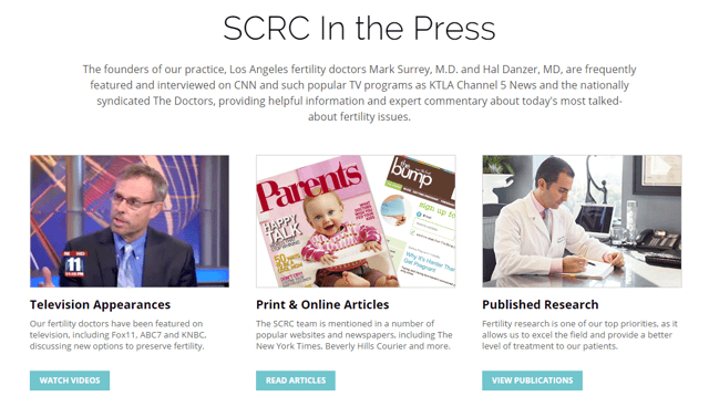
Here's an example from the Southern California Reproductive Center, a clinic that specializes in in-vitro fertilization. Their nationally-renowned doctors and practice have been featured in several news publications and medical journals.
A strong positioning strategy and clear UVP gives you the framework you need to establish yourself as a thought leader. Thought leaders are experts in their field—they’re doctors with sought-out opinions and best-in-class advice. Thought leaders are easily recognized by the expert advice they offer and through the high value content available on their website.
Bottom line: a thought leader is an authority in their industry, with a sought-after opinion. Identifying your UVP and narrowing your target audience is a way to build this reputation for yourself.
3. Not focusing on the user
People land on your site looking for solutions to a problem or to learn more about why you’re a better option than your competitors. You need to make it as easy as possible for them to find and consume the information they need.
Common impediments include:
- Duplicate content – Many “medical marketing companies” recycle the same content across all their client sites without adding any unique value other than swapping out the logo and contact information. This is also terrible for SEO and getting found in the search engines. If you have one of these sites you’ll need to ditch it - STAT.
- Generic content – In an industry that revolves around personal treatment, the worst thing you can do is stuff your website with crappy stock images and token advice that may as well have been plucked from Wikipedia. Your content needs to educate, engage and build trust amongst your prospects. It needs strategy and personality if it’s going to bring patients in the door. And please stop using pictures like these on your website:

- Information overload – Too many options overwhelm your visitors and make your calls to action impossible to find. Clarity and simplicity are key. Your visitors shouldn't need a map to navigate your website. Keep it simple and the message will be that much more impactful.
- Bad writing – We’re not talking about grammar and spelling here - that’s a no-brainer. Beyond the basics, your website content needs to be written for the user. Speak in their language not yours. Communicate benefits. Don’t talk down to them or over their heads. No over-the-top technical medical jargon. And communicate urgency where necessary without fear-mongering and high-pressure sales tactics.
4. Only offering a "Contact Us" or a "Consultation Request" button
The VAST majority of your website visitors are not ready to contact you yet. Period. They’re researching high-level solutions to a problem or evaluating you as a possible candidate to help them. But they’re not ready to schedule an appointment yet. That doesn’t mean you should just send them on their way.
If all you’ve got is a schedule a consultation or a contact us form on your site you’re leaving way too much opportunity on the table.
You’ve invested in SEO, PPC, billboards - whatever - to drive people to your website. Turn more of those anonymous visits into leads by giving them something of value in exchange for their contact info.
Examples include:
- Guides explaining complex procedures for new patients
- eBooks detailing treatment options and protocols
- HIPAA-compliant case studies or patient success stories
- Q&A-style webinars to answer common questions
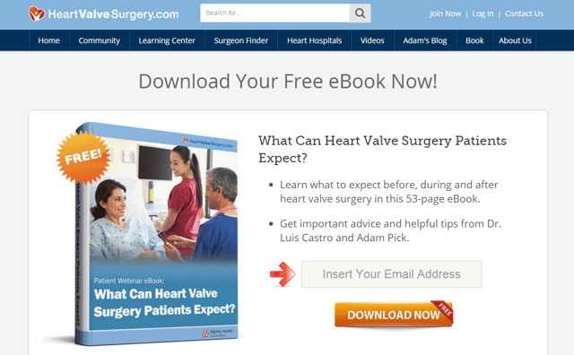
This free ebook from HeartValveSurgery.com is an effective way of converting patients who may need some more information before committing to a surgical procedure.
The more of these offerings you have on your site, the more leads it will generate for you around the clock. You’ll also be providing value that your competition isn’t - the kind of relationship building that creates trust and helps your prospects see you as the best option amongst your peers.
5. Ignoring search engine optimization (SEO)
You’ve probably built an “SEO friendly” website - it’s easy for search engines to crawl, you’ve got keywords in the right places and so on. So is that enough to show up above your competitors? Not by a long shot.
There are “on-page” and “off-page” components to SEO. On-page refers to how your site is built and optimized, while off-page is more about what happens “off” your website - and elsewhere on the internet.
They’re both important, and here are some things you need to get right for each:
On-page
- Make sure all content is indexable including images, videos and plugins
- Make sure your link structure is crawlable
- Use friendly URL structures
- Optimize pages, title tags and meta descriptions
- Avoid duplicate content
Off-page
- Build quality links
- Share and promote your content
- Optimize for local and mobile search (see below)
In most cases off-page SEO requires significantly more effort to be done well. Link building is a key component of SEO success. If high-quality websites aren’t linking to you, Google won’t trust you and your rankings will suffer.
6. Not optimizing for mobile
58% of mobile users search for local businesses daily on their smartphone, and 89% search at least once per week. What's more, 70% of mobile searches result in action being taken within an hour—meaning that people are searching on the go, for instant solutions, and putting their newfound knowledge to use.
Google has made it clear that if your website isn’t optimized for mobile searches - your rankings will suffer.
Most mobile optimization factors center around user experience and include:
- Larger, legible fonts
- Fast load speed
- Bullet lists and pared down text
- Simpler navigation and fewer internal links
- Fewer images
Make sure you have a responsive website - that is, a website that adapts to the device that is being used to view it. This, versus creating a separate mobile website, is Google’s preferred way to optimize for mobile.
Migraine Relief Center's responsive website is a good example of this. The mobile site is easy to read, navigate, and interact with. Also, the content looks great regardless of the device's screen size.
7. Not optimizing for local search
Like mobile, local search has a unique set of ranking factors that you need to be aware of and optimize for. To be clear, local search involves any keyword that is geographically qualified - for example, infertility treatment in Santa Barbara.
For many healthcare practices, all business is local and showing up higher in the local search results can have a huge impact on scaling growth.
Ranking well for local searches hinges on the following:
- Optimizing the location page(s) on your website (especially important for practices with multiple locations)
- Links back to your site from other trusted local websites - quality vs. quantity
- The accuracy, volume, and consistency of your practice’s business listings - or citations - across select business directories on the web
Read a more in-depth study on local ranking factors here.
8. Lack of patient testimonials
Positive social proof is a powerful tool—testimonials carry all the power of a good word of mouth endorsement and help establish trust in your abilities. Written testimonials are great, but more in-depth “patient success stories” can have a huge impact on converting on-the-fence prospects into patients.
For example, videos or case studies that chronicle a patient’s journey from challenges to a solution can create an emotional connection that a few lines of text just can’t do.
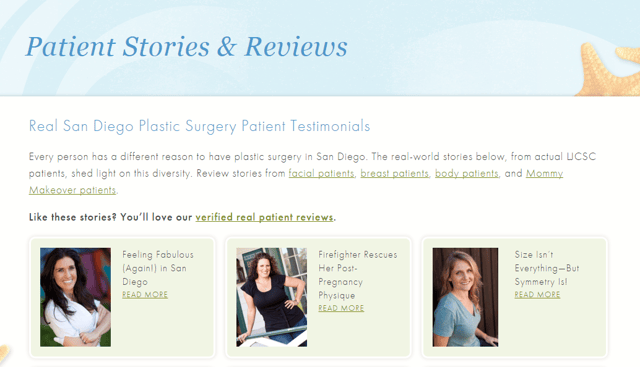
The La Jolla Cosmetic Surgery Center features quite a few patient testimonials on their website. Each patient offers insights into why they chose to get surgery, how they felt before and after their procedures, and other aspects of their experience.
9. Not blogging strategically
Hint: no one cares about your Christmas party.
While a blog can be a great way to show some personality, its real power lies in its ability to drive new, qualified prospects to your website.
Most organizations either don’t blog at all or blog haphazardly whenever there’s time. Strategic blogging is centered around an in-depth understanding of your ideal (most profitable) patients and what they’re searching for online.
In a nutshell it looks like this:
- Develop “ideal patient” profiles (often called personas)
- Determine the challenges they have and the questions they’re asking
- Research the keywords they are using to search for answers
- Develop targeted blog articles that answer those questions
Every blog post you publish should be geared toward capturing searches that your prospects are conducting online. The more the better. Every time they find your post in the search results, that’s another qualified visitor that’s clicking through to your website and not your competition’s.
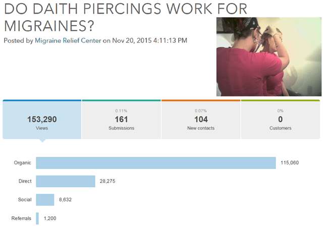
The Migraine Relief Center struck gold with their post on daith piercings for migraine relief. The post saw over 115,000 views from organic searches, alone. That means that people were finding the post just by searching for relevant terms online.
10. Not measuring your return on investment (ROI)
Like it or not, your medical practice is a business, and only through measuring and tracking the right numbers will you be able to answer specific questions like:
- How much does it cost to generate a new patient from the web?
- Is organic SEO or pay-per-click advertising driving more business?
- How much revenue has marketing generated this quarter?
- Which activities should we invest more/less in?
While one of the big benefits of digital marketing is the ability to track everything, you need to avoid information overload and focus on the important numbers - not the fluff.
Final Thoughts
"If you build it, they will come." Maybe in Hollywood, but in the real world it’s not that simple.
It’s time to take a good, hard look at your practice's website and transform that glorified brochure into a marketing machine.


