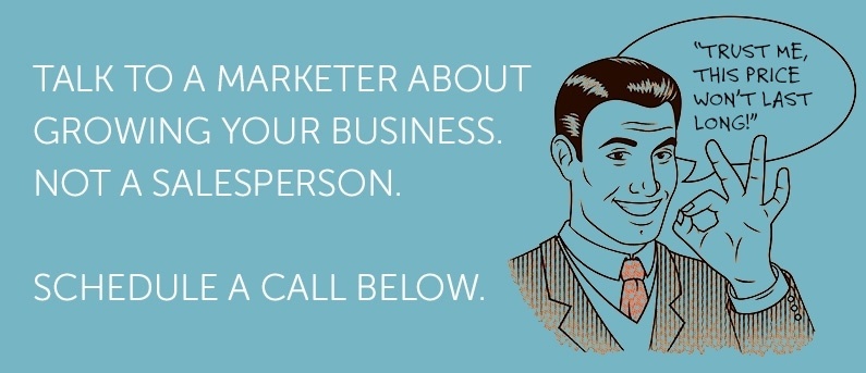
You don't want people to just visit your website; you want them to become customers. There may be several steps along the way as they pass through the sales cycle, but for each of those steps you are calling them to take some kind of action.
Those calls to action usually involve the prospect clicking on some kind of graphical image or button. Call-to-action buttons are key parts of your online marketing efforts; if you want to maximize your conversion rate, you will need to optimize your calls to action.
Optimizing your call-to-action buttons does not have to be rocket science. In fact, here are five relatively simple ways to go about the process.
1. Put them on every page.
You want your prospects to take action on every one of your pages they visit, even if that action is sometimes simply to continue on to another page. That means you should have a call to action on every single page.
Don't think this is overkill. You never know what page people will use to first enter your site; they are just as likely to find a random blog post through a search query or social media share as they are to enter through your home page. You want them to take the next step no matter what their entry point is.
2. Place them above the fold...and sometimes below it as well.
You want to make absolutely sure that the call-to-action button is visible, and that means placing it near the top of the page. That way every visitor will see it, even if they don't bother to scroll down.
If the page contains a blog post or some other long piece of content, you also don't want to assume that they will scroll back up to the top after reading the page. That is why, in addition to the one above the fold, you should consider placing a second call to action at the bottom of the page.
3. Use contrasting colors.
You want the button to be visible and noticeable. If you use the same color scheme as the rest of the page, you might as well be using camouflage. Instead, choose a button color that stands out on your site.
4. Make sure it fits the context.
You are going to have different types of calls to action, with different goals. Make certain that the offer on each page relates to the content being provided. You want the call to action banner to represent the logical next step, based on what they have just read (and therefore indicated an interest in).
5. Improve the language.
Each call to action is an offer, and that offer needs to be compelling for the prospect to bother clicking on it. Consider what your prospect is thinking:
- Why should I care?
- What benefit will I get from clicking on this button?
- Are there any costs or risks associated with accepting the offer?
- Let me think about it, and maybe come back later.
You want to overcome such questions or objections, ideally using as few words as possible. Your copy should emphasize the value they are getting and provide a sense of urgency so that they take action before leaving the site.
Luckily, you don't have to rely on guesswork when optimizing your call-to-action buttons; since each one is asking for a response, you can easily test different options and determine which variations produce the highest conversion rates.
By taking these steps, you will turn more visitors into leads and more leads into customers. That makes optimizing your call to action buttons an action well-worth taking.
* Image courtesy of freedigitalphotos.net

