Boo-oo-oring! That’s a death knell to any business website, regardless how much you spend on making it pretty to attract visitors. And to avoid “boo-oo-oring” your users you need to keep pace with web design trends. With all the cool, crazy things you can do with technology now, is it any surprise that we’re looking forward to making it a better place this year? We brought you some; ignore them at your peril!
#1: Less is More
Simplicity has always had an appeal, and now the trend has moved to the web with:
- Simplified Content - Websites now have shorter paragraphs instead of long narratives, bullet points and numbered lists and clear subheadings that make it easy to read.
- Monochrome Color Schemes - The new fad is using monochrome color schemes that use one main color with white, or at the most two colors. A popular choice is black text on a white background, with a splash of color here and there to make things pop.
- Personal Portfolio Websites - These websites are in, which form a human connection, convey information about the website owner and provide insight into who you are, where you’ve been and the work you’ve done. Make sure to provide a personal photograph of yourself.
- Minimalist Text - Sidebars are now gone, images are fewer and pages don’t try to include everything in the space above the fold.
- Mega-Navigation Options - You can include a whole lot more in one or two boxes by making them expandable when you mouse over them. Search fields also expand, meaning you can input your entire query without being told you’ve exceeded the length.
If you want to get away from a site that looks like a Middle Eastern bazaar, then now’s your chance. Change it up and avoid sending your users scuttling when they land there. Rather keep them and convert them into disciples and potential leads by following best practice do’s and don’ts.
#2: Fabulous Fonts
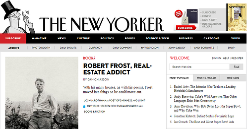 The New Yorker
Put some zing into your pages with customized designer fonts, which are so much more exciting than the outdated, overused Times Roman and Verdana. More and more, designers are breaking away from the norm with new fonts to match the imagery on the website. They’re creating typography that has personality, by using two or three different fonts in different colors and styles to break up the monotony.
#3: Scrolling is In

Click or scroll? Scroll or click? For the longest time, website navigation worked by getting the user to click from page to page. The challenge was choosing between lots of navigation buttons and a few clicks, or fewer buttons that required more click-throughs. Then came infinite scrolling, which worked really well with the swipe of a finger on tablets and smart phones.
In 2014 scrolling is still big news, with horizontal scrolling a la Apple’s Magic Mouse kicking butt. The secret to infinite scrolling, whether it’s Parallax, column-based, vertical or horizontal, is to keep your content well-organized, change up the design so the user doesn’t get bored and use a fair amount of white space to stop it looking cluttered.
The new love affair with scrolling also fits well with the shift towards fewer pages. Yes, we know the SEO principles say make more pages, but the truth is that many website owners are making fewer pages in an effort to simplify—and enrich—the user’s experience.
#4: Hail the Hero (Area)
With sliders all the WordPress rage for the past couple of years, we seem to have forgotten how to do a website any other way. Relief is at hand in the form of the Hero area, which grows bigger every time a new site comes out—or so it seems. Ok, what the heck is that, you ask! Well, we have to answer that it’s currently the number one trend in web design right now, in our opinion.
The Hero area is the intro section at the top of the website, just as it is on a print design. It’s used to portray an image of cleanness and simplicity, while being an ideal location for publishing branding, special content and announcements. When you need an attention-grabber, the Hero area is the place to post it.
Make the most of this space with huge background images manipulated using overlays, blurring, filters and other special effects.
#5: In the Beginning, the Web Wasn’t Flat

Ok, so what’s the big deal about flat design and why is it taking off in the website world? One word: Evolution. In the beginning of the Internet age, we tried hard to make digital things resemble real life—buttons had shadows, images were in perspective etc. It was called “Skeuomorphism.”
Since then, however, we’ve become used to the fact that we’re dealing in abstract concepts and we no longer feel the need to imitate reality. Flat web design is here to stay, for a variety of reasons:
- It’s Quicker – both to design and to load
- It’s Usable - mainly because it’s easy to get around
- It’s Honest - it’s 2D and doesn’t try to pretend to be 3D
We no longer need to fool ourselves or others. We know we’re playing in a digital world and we love it.
#6: Mobile Mastery

Yes, we keep hearing that this is the year of mobile magnificence. The problem is it’s true. As inconvenient as that may be for anyone with a less-than-mobile existing site, you’re going to have to revamp mobile to be responsive. Mobile access makes it possible for users to integrate with social media, subscribe to newsletters, participate in discussions and comment on blogs, which all helps to make the web a better place.
With every man (and woman) and his brother now accessing the Internet via mobile devices, if your site isn’t available on mobile it’s just not going to be visited. And don’t think you’ll get away with converting your current site—that leads to unwieldy loading and challenging accessibility. Just do the site again. It will be worth it!
#7: Versatile Video

One minute of video is worth 18 million words. Or so the buffs keep telling us. Add that to the fact that users have gotten lazy and don’t want to read screeds of text, and you’ll know why video has become so popular that YouTube users upload 100 hours of footage every minute of every day. Many of them are business-related, such as explainer videos that increase brand awareness and provide viewer advice.
The new HTML 5 video option completed the transition from text to video by making it easier to create custom clips and moving backgrounds without having to resort to Flash.
With all this and more about to unleash on the web design world, it’s no surprise for firms to find they need to move—and move fast—to capitalize on the available software. Take your website to the top of the game by staying abreast of trends and implementing ways to make them your own.